The Structure Principle
The interface of the software should have a meaningful design and be easily identified by the user. The more identical features should be grouped together and their opposite features have to be built separately so there is a clear distinction between them in order not to confuse the user.
Technique 1 Set standards
Technique 2 Align fields effectively
Technique 3 Understand the UI widgets
All the iTunes versions follow the same protocol with very minimal differences. All the columns are strictly divided by name, artist, albums, genre, etc. iTunes provides quick access to its main widgets. For instance: library, store, shared, genius, and playlists.
The Simplicity Principle
What makes things simple? Clearly, reproducibility and repetitiveness makes things easier. Additionally, having the option of multiple language interfaces would provide access to all users. Use of shortcuts (e.g. hot-keys) within a design would also contribute towards simplifying a given task.
Technique 1 Consistency
Technique 2 Group things effectively
Technique 3 Word your messages and labels effectively
Skype UI provides an example of a simplified display. In addition to having multiple languages for users, the organizational format is easy to become familiar with. For example, the contact lists and task buttons are displayed in a simple to use column format and hot-keys are available for efficiency.
The Visibility Principle
The interface should be noticeable by providing the user appropriate information about the software functionality and should not bewilder the user by providing unnecessary information.
Technique 1 Use color appropriately
Technique 2 Navigation within a screen is important
Technique 3 Your design should be intuitable
Microsoft Word prompts users of spelling errors by underlining the word with a red color and uses a green color to indicate an error in grammar or sentence structure. Furthermore, the built in dictionary lets you find a necessary word faster and easier by providing suggestions. These features, in addition to the alignment of the main tools on the ribbon from left to right, provide a functionally noticeable interface.
The Feedback Principle
Any errors, exceptions, changes of state or unusual conditions should inform users in a clear and concise method.
Technique 1 Use color appropriately
Technique 2 Expect your users to make mistakes
Technique 3 Don’t create busy user interface
Eventually most users will come across a problem in the form of an error, change of action, and so forth. In such a case, the UI should identify this action. For instance, the iPhone’s SMS texting software indicate errors with a white exclamation mark superimposed over a red background providing a simple and effective method to denote a problem to the user .
The Tolerance Principle
An effective interface should allow the user to make mistakes and correct them at any point of time.
Technique 1 Expect your users to make mistakes
Technique 2 Don’t create busy user interfaces
Technique 3 Explain the rules.
 |
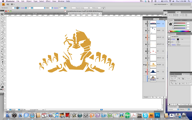
| Here is an example of a busy interface making it difficult to use. |
Adobe suite allows users to make mistake and undo them by clicking CTRL + Z.
The interface should be simple and easy to navigate.
The rules should be clearly defined by the UI. Avatarize yourself application provides easy to follow step-by-step rules.
The Reuse Principle
Consistency within an interface design may provide a function of reusability minimizing the users need to rethink and remember.
Technique 1 Explain the rules
Technique 2 Navigation between major user interface items is important
Technique 3 Your design should be intuitable
Power Point provides templates of slide layouts, themes and backgrounds allowing a reusable interface for the user. The multi–format view option in this software allows a consistent and flexible interface that is readily understandable and easy to learn.
Project was made with Mohsin Kamal http://mohsinkamalmohammed.blogspot.com/
Project was made with Mohsin Kamal http://mohsinkamalmohammed.blogspot.com/


